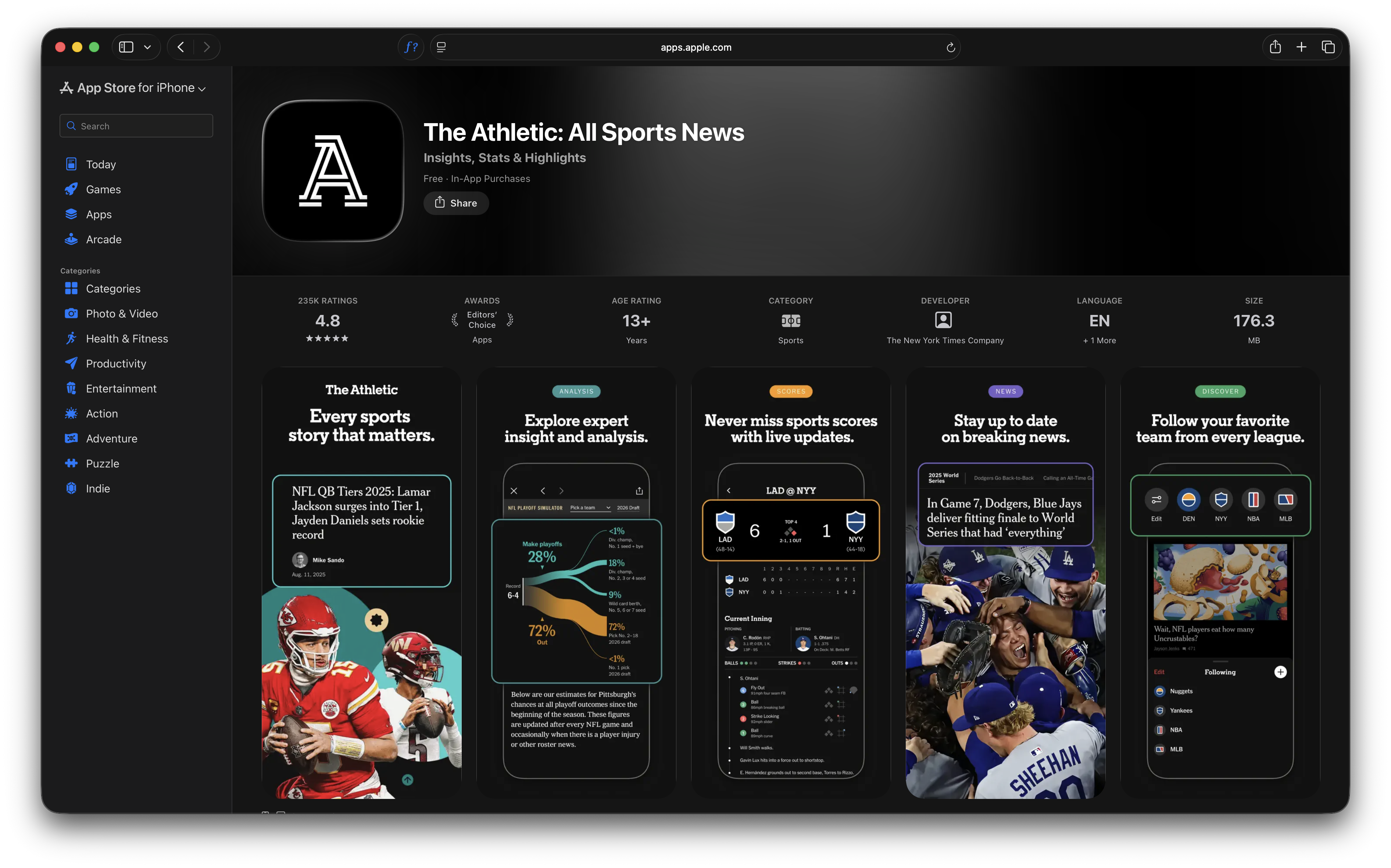
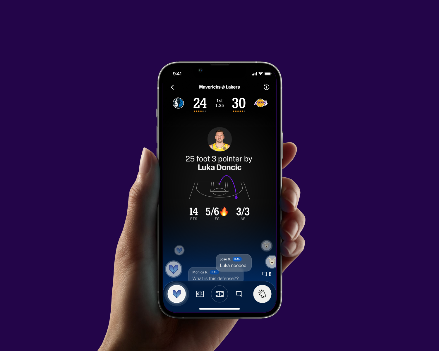
The Athletic is a subscription sports media company — one of the most ambitious bets in modern sports journalism. Launched in 2016 and acquired by The New York Times in 2022, it built its reputation on deep, expert reporting across every major sport and market, with a roster of hundreds of journalists and a subscriber base of millions of passionate fans.
When I joined, the product design team was small, scrappy, and working fast. Over the next three and a half years, we built a lot. A design system. A new type system. Video highlights. New feed patterns. A commercial product ecosystem. And a team that got sharper and more confident with every project they shipped.
This is a record of some of that work — and of the designers who did it.
Building the foundation: Chalk
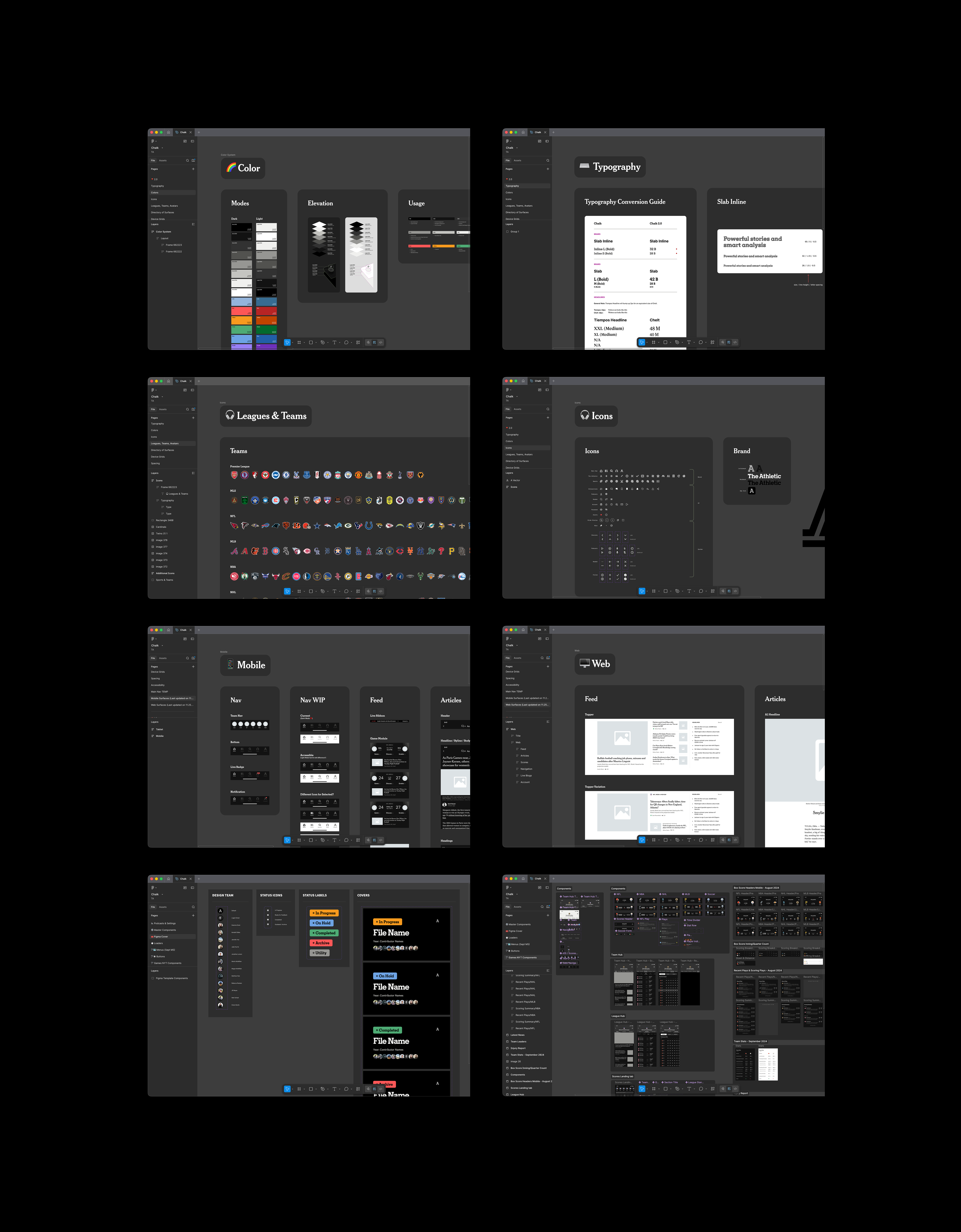
The Athletic’s design system didn’t have a name when I arrived. It barely had a system. We had inconsistencies across platforms, styles that had drifted apart over time, and no shared language for the design team to work from.
So we built one. We called it Chalk.
I led the audit of what existed, made the decisions about what stayed and what changed, aligned styles across every product surface and platform, and facilitated a naming exercise to make it our own. A Senior Product Designer owned the production design work: building out the component library, resolving inconsistencies at the component level, and shipping it into Figma in a way the whole team could actually use.
What started as a tool for the design team didn’t stay there. Our mobile development team adopted Chalk and turned our styles into tokens — bridging design and engineering in a way we hadn’t had before. A design system that began as a Figma library became the shared language of the entire product team.
Typeface migration: Project Gameplan
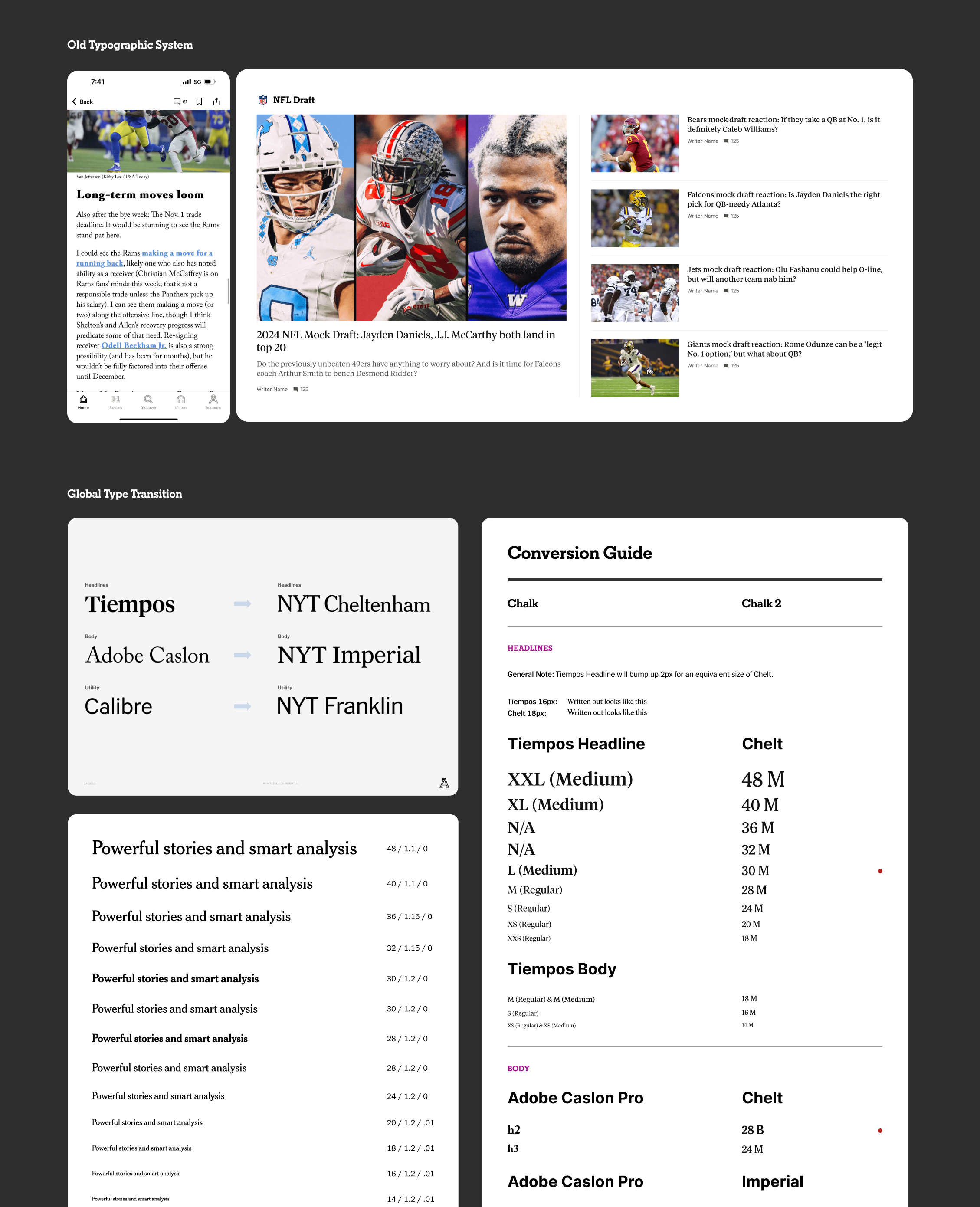
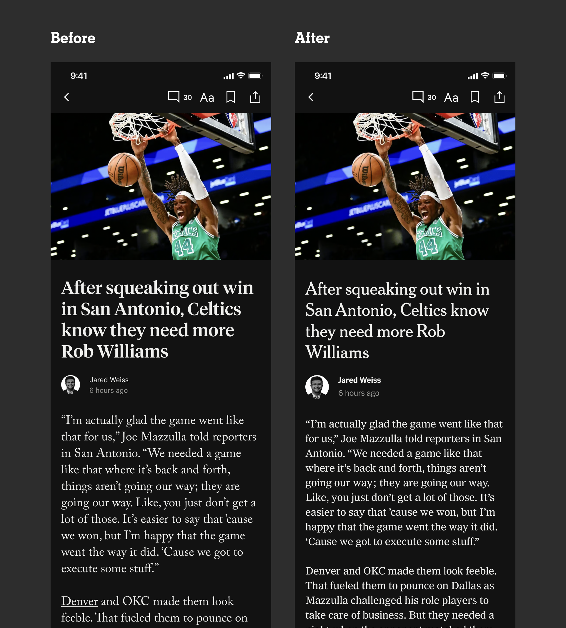
One of the first things I noticed when I joined The Athletic was the typography. Across the product, things didn't add up. Web and mobile felt like two different products. Headlines on articles were rendering with faux bold — a browser-level hack that signals a missing font file, not an intentional design choice. Links looked broken in places. The type wasn't passing accessibility tests. For a journalism product sitting inside The New York Times ecosystem, it didn't feel premium. It felt unfinished.
I started mapping what it would take to fix it — which type styles were being used where, where the inconsistencies were coming from, what a cohesive system would actually require. Then we found out The Athletic was moving to the nytimes.com domain, which meant our existing font licenses wouldn't transfer. What had been a craft problem suddenly had a business case behind it. We had permission — and a deadline — to fix everything from the ground up.
I made every typographic call across the product — which NYT typefaces to adopt, how to apply them across mobile, web, editorial, and marketing, and how to handle every edge case in between. Those weren't just internal decisions. Each one was reviewed and approved by our Executive Editor and The New York Times Brand Creative Directors. A Senior Product Designer handled implementation, QA, and the rollout across every surface.
The product launched on the new domain with a type system that finally felt like it belonged there.
No items found.
Video Highlights
The Athletic built its reputation on writing. Video was new territory.
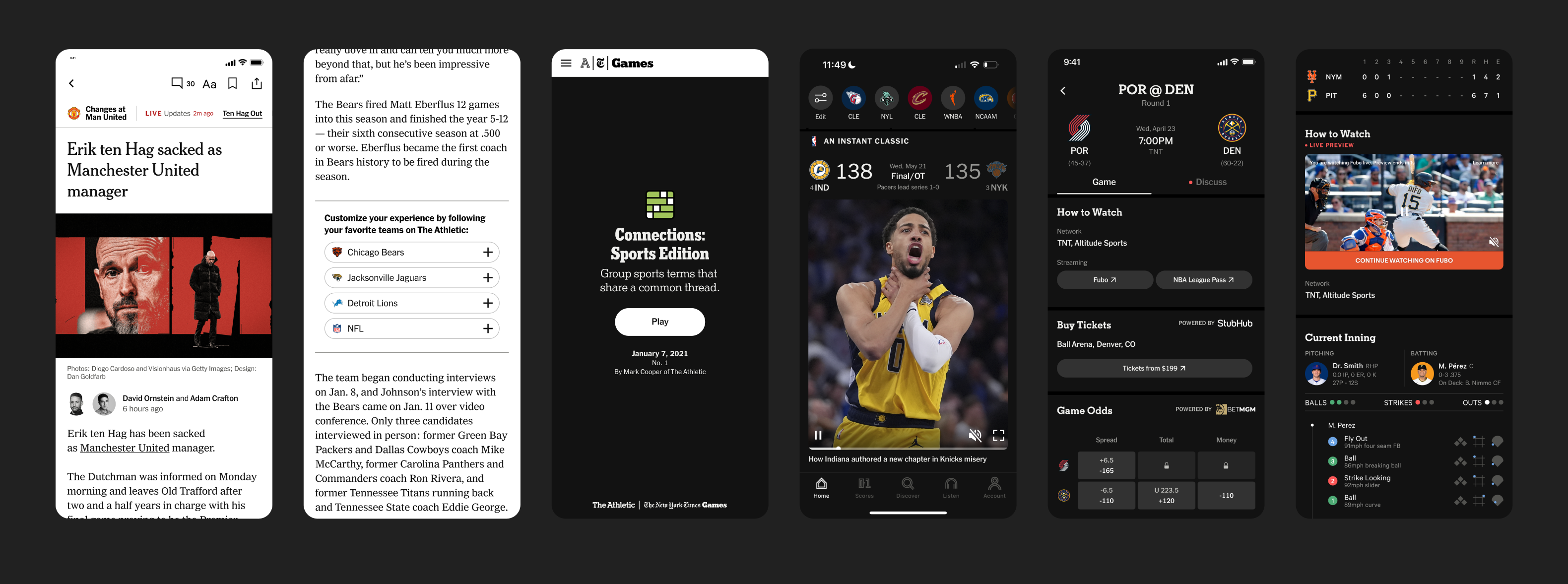
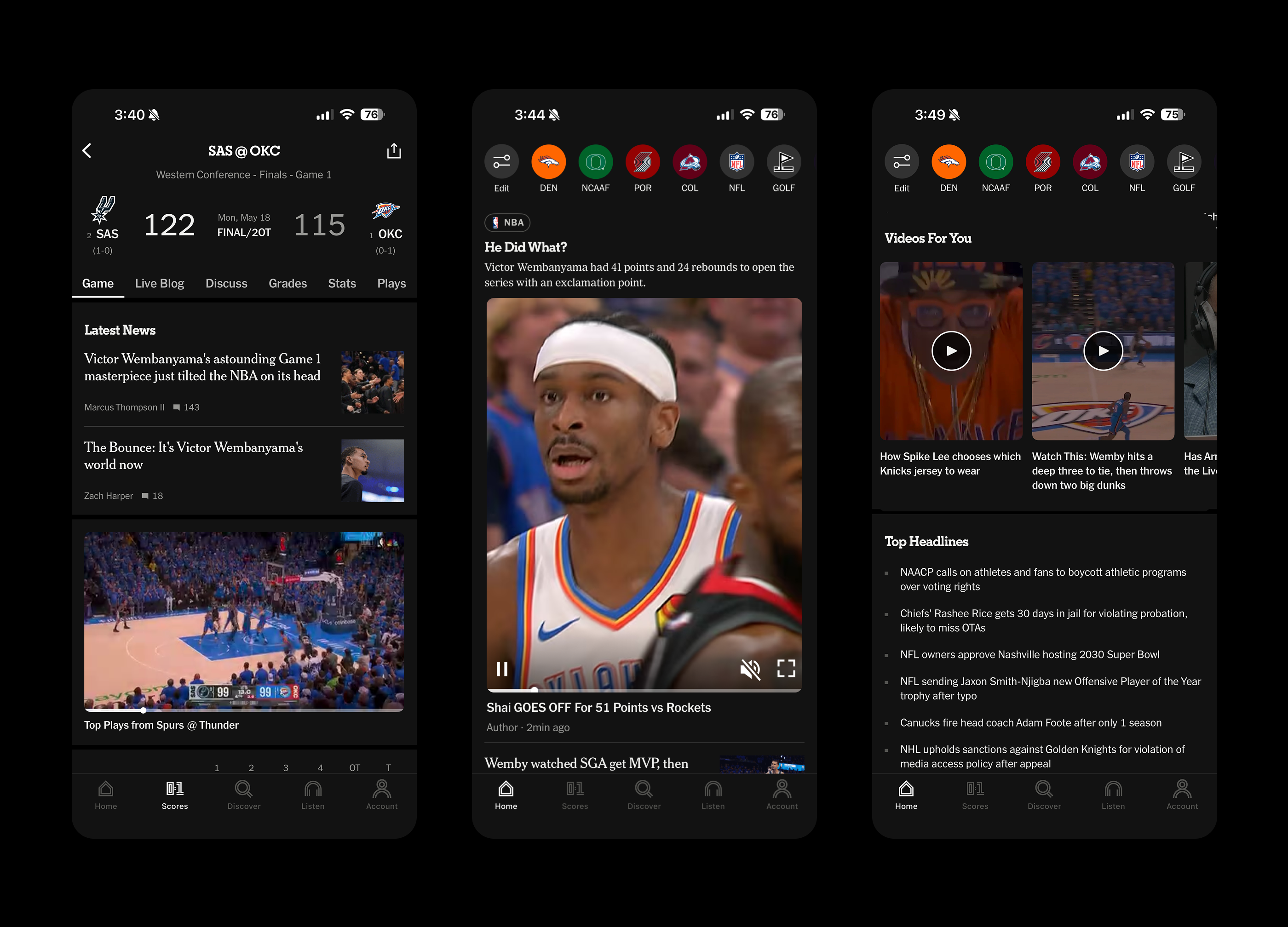
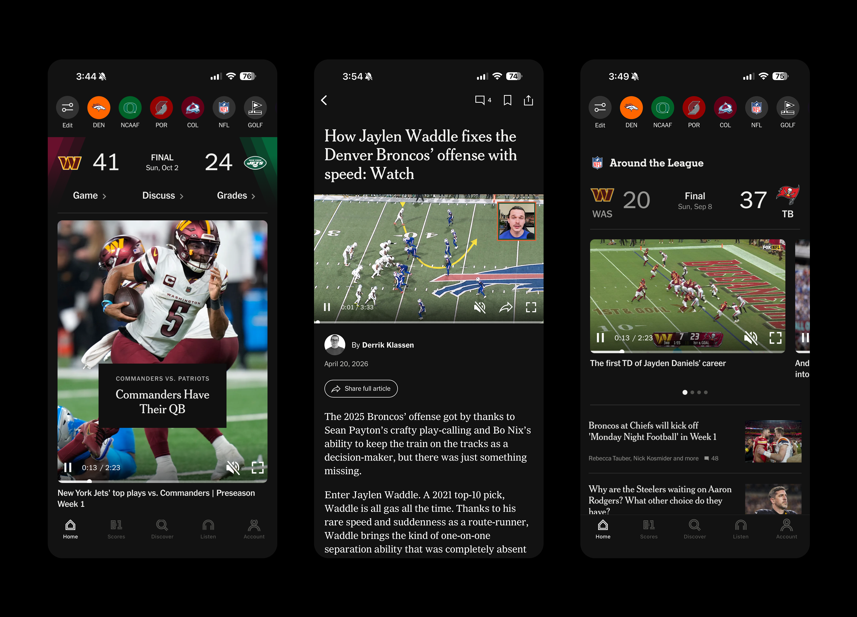
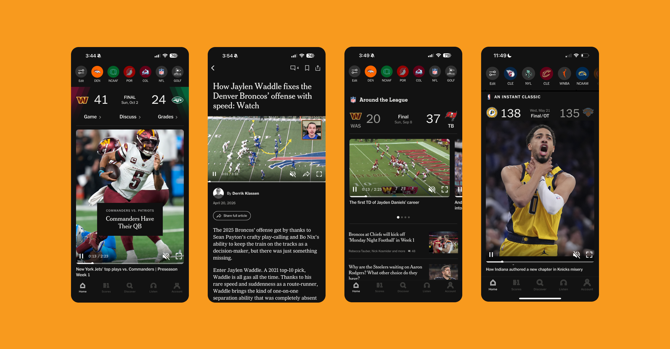
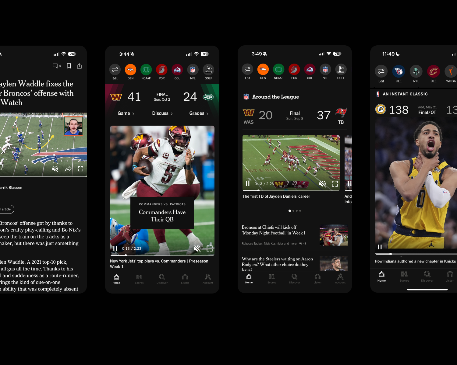
I directed a Senior Product Designer through the full arc of introducing video highlights into the product — starting with NBA highlights alongside box scores, then expanding into the home feed, curated modules, and a dedicated Watch experience. Each phase raised new design questions: How does video sit alongside editorial content? How do you design for a user who came to read, not watch? How do you make highlights feel native to a journalism product rather than bolted on?
We figured it out one surface at a time. Engagement consistently beat our goals — by enough that the success of NBA highlights gave leadership the confidence to invest in NFL highlights, a significantly more expensive rights acquisition and a major milestone for the company.
Game modules in the feed
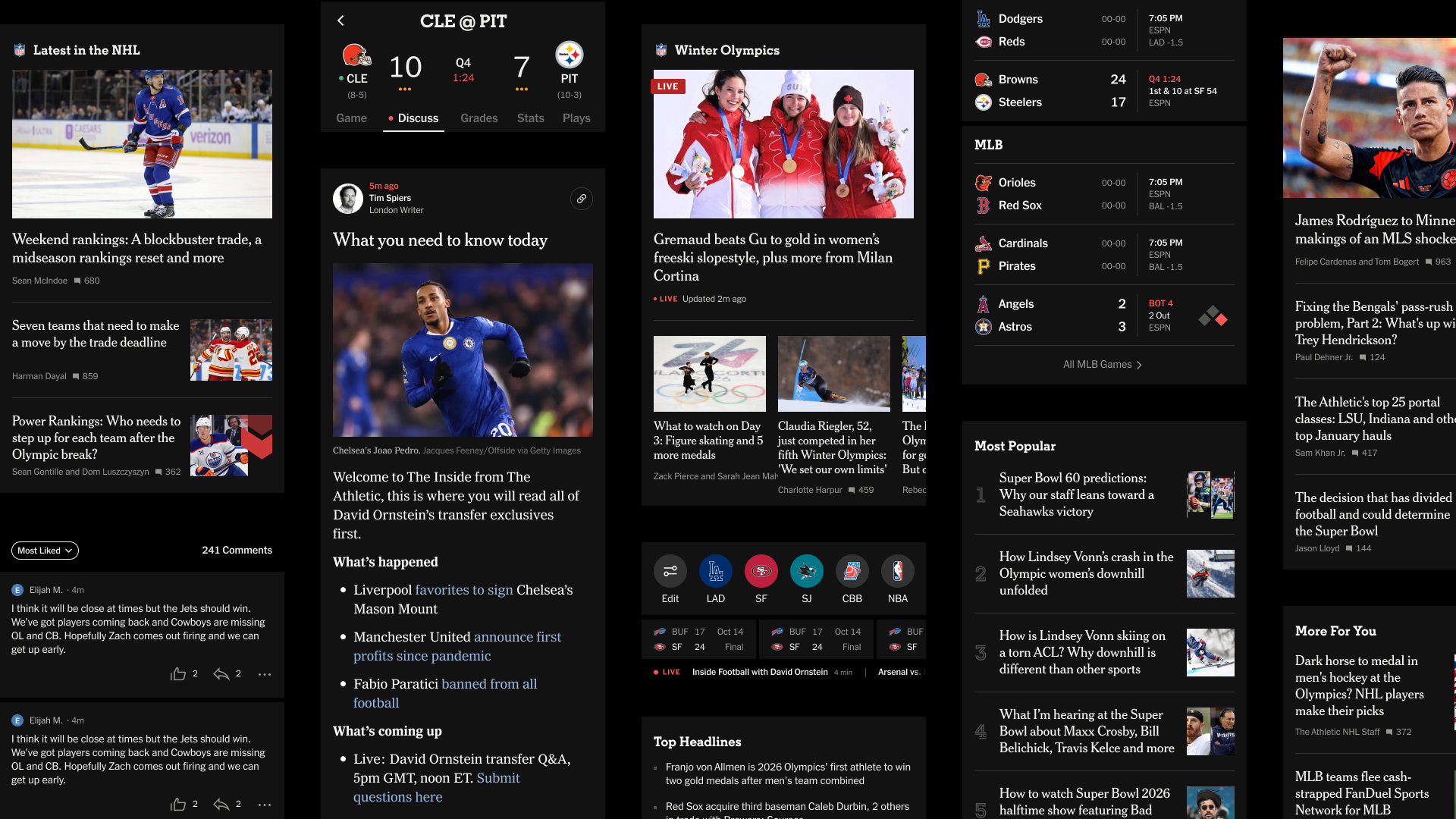
The Athletic’s home feed used to show one thing: article thumbnails and headlines. That was the pattern, and it worked — until it became a ceiling.
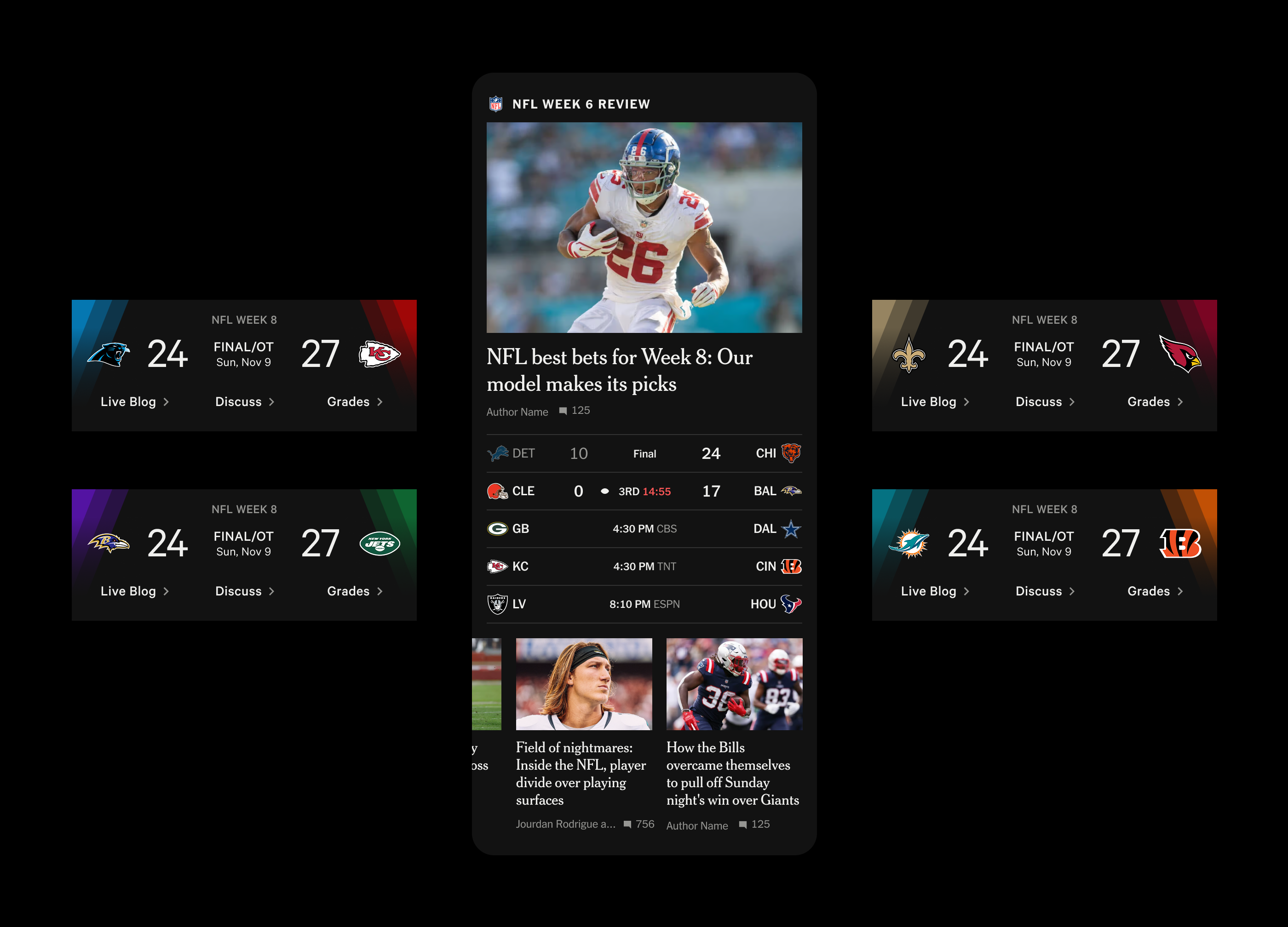
I worked closely with a Senior Product Designer to design a system that let editors place live game previews and scores directly into the home feed. It sounds simple. It wasn’t. It required a new design pattern flexible enough to handle every sport, every game state, and every editorial use case — and it had to feel native to a feed built around journalism.
It shipped. Editors loved it. Traffic to our scores surfaces from the home feed increased significantly.
No items found.
Commercial product
Design and revenue don’t always make easy partners. We made it work.
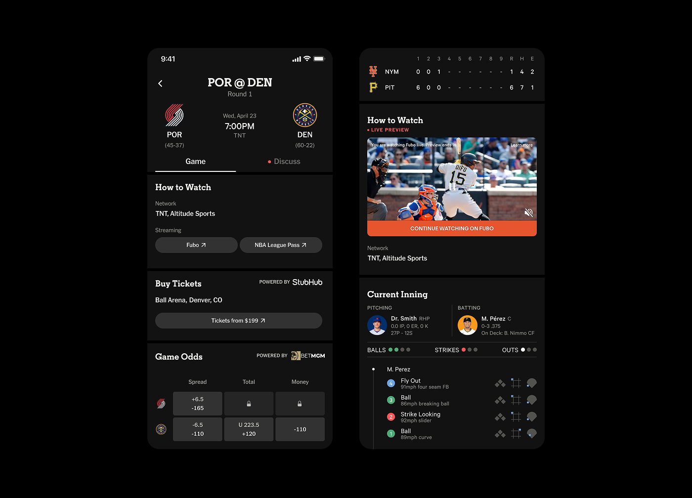
I led and directed a Senior Product Designer who built out The Athletic’s commercial product design — a suite of advertising and partnership integrations woven into the product without compromising the experience fans came for. The most ambitious was a live Fubo stream preview embedded directly in the box score: a real-time video window into a baseball game, right next to the stats.
Beyond that: streaming links and betting odds on schedules and box scores, ticketing integrations, an eBay collectibles module for team hubs and articles, and a Paramount+ sponsorship of Connections Sports Edition. Each required designing for a commercial goal while protecting the product’s integrity.
The work consistently hit its revenue targets without hurting engagement. That balance is harder than it sounds.
And everything else
Player grades in box scores. Recirculation modules at the end of articles. Storyline navigation inside long-form pieces. Golf added to our scores platform. Small things, shipped well, that made the product more useful for the people who relied on it every day.
Three and a half years goes fast when the work is good. I'm genuinely proud of what this team built — the product looks and feels different than it did when I arrived, and I know we had something to do with that. The Athletic is a special place, and I'm grateful to have been part of it.