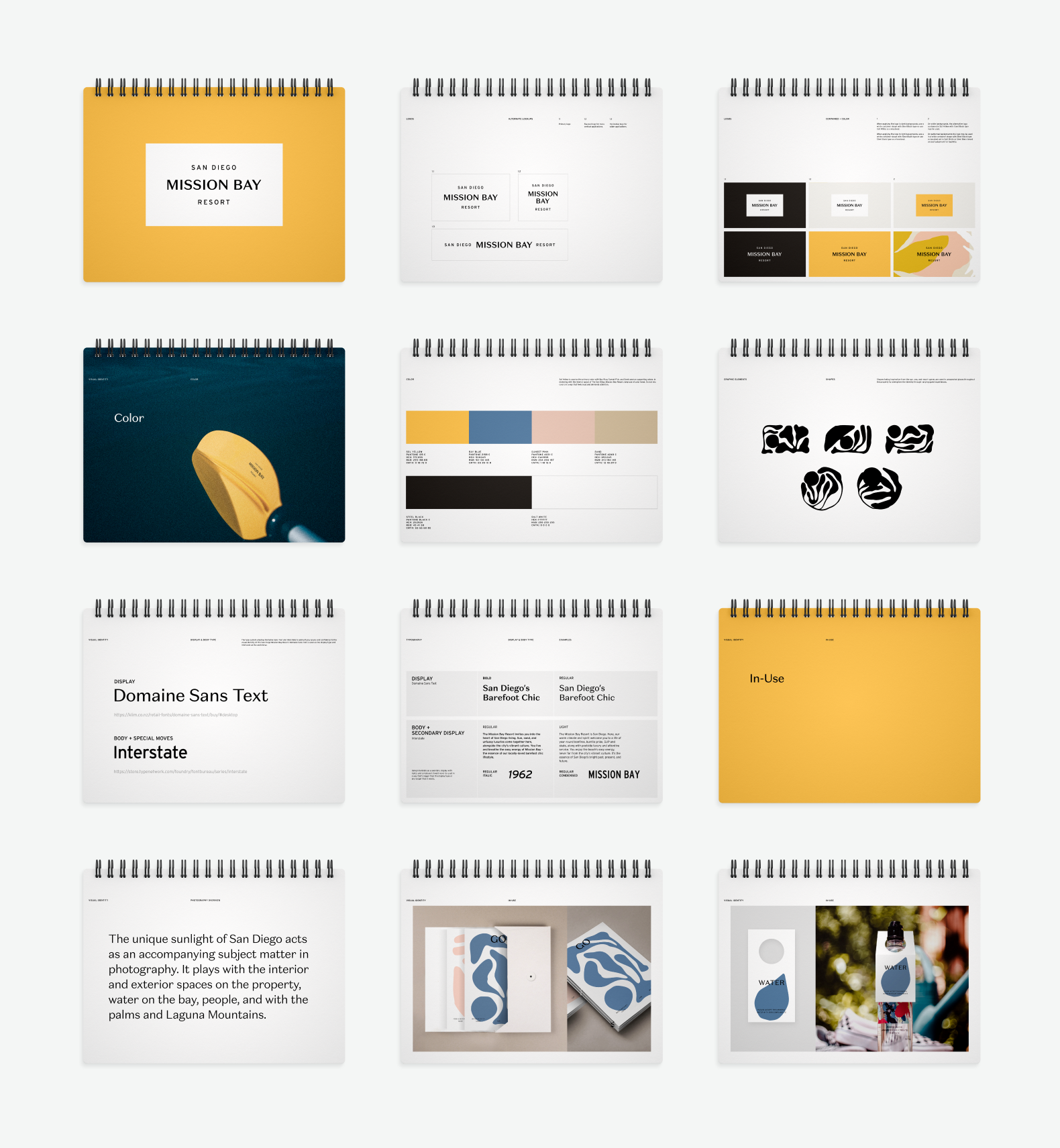
San Diego Mission Bay Resort had a story worth telling. A waterfront property with real character — the sun, the bay, the easy grit of San Diego's surf-and-skate culture — but a brand that hadn't caught up to it yet. Working closely with Noble House Hotels and the resort's management team, we built a visual identity from the ground up that felt like it actually belonged there.
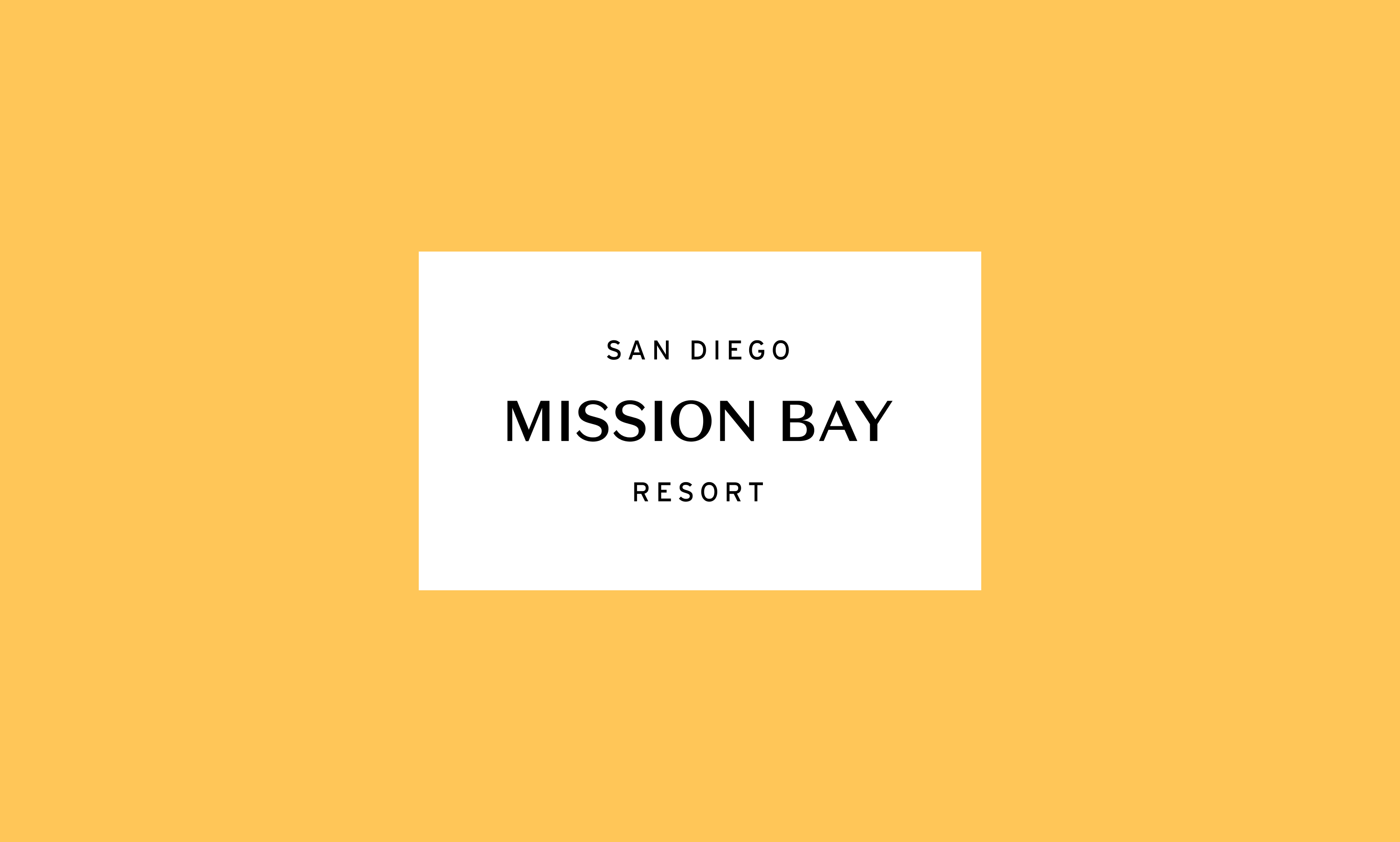
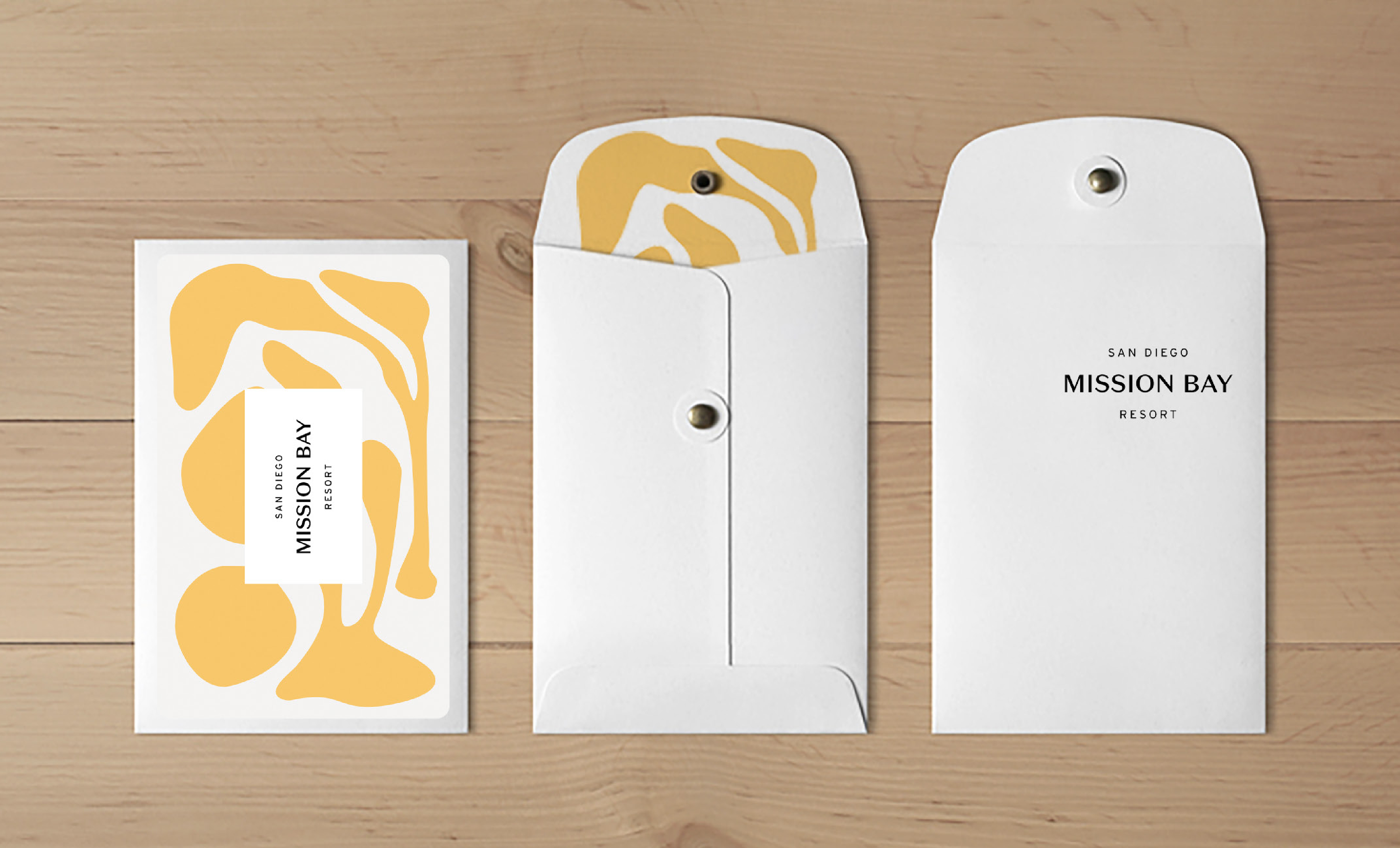
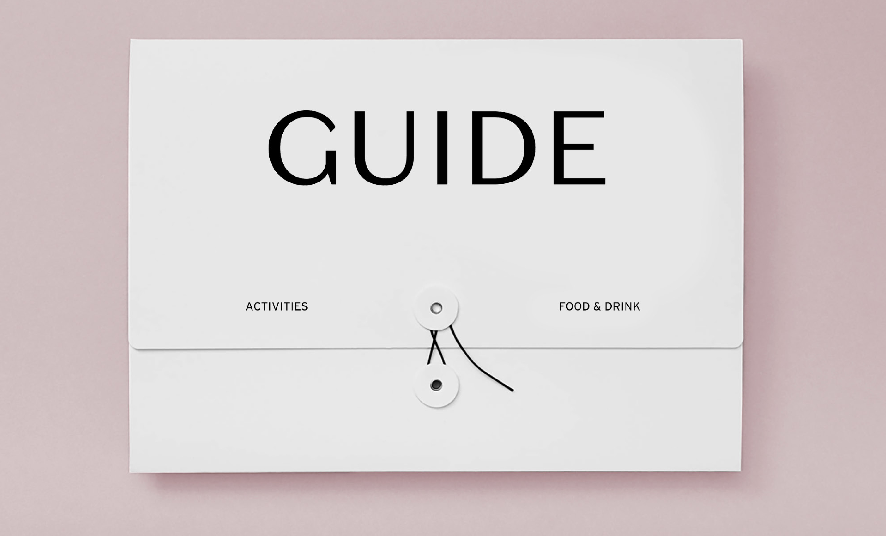
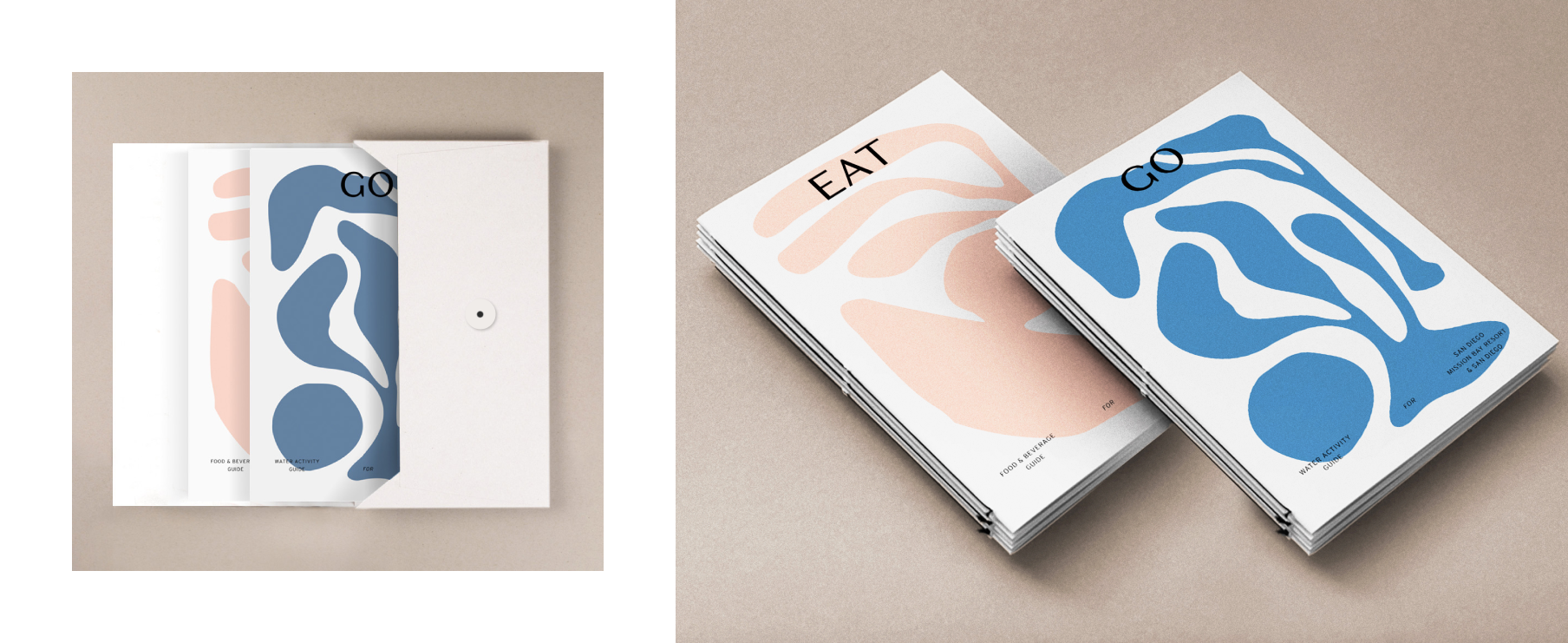
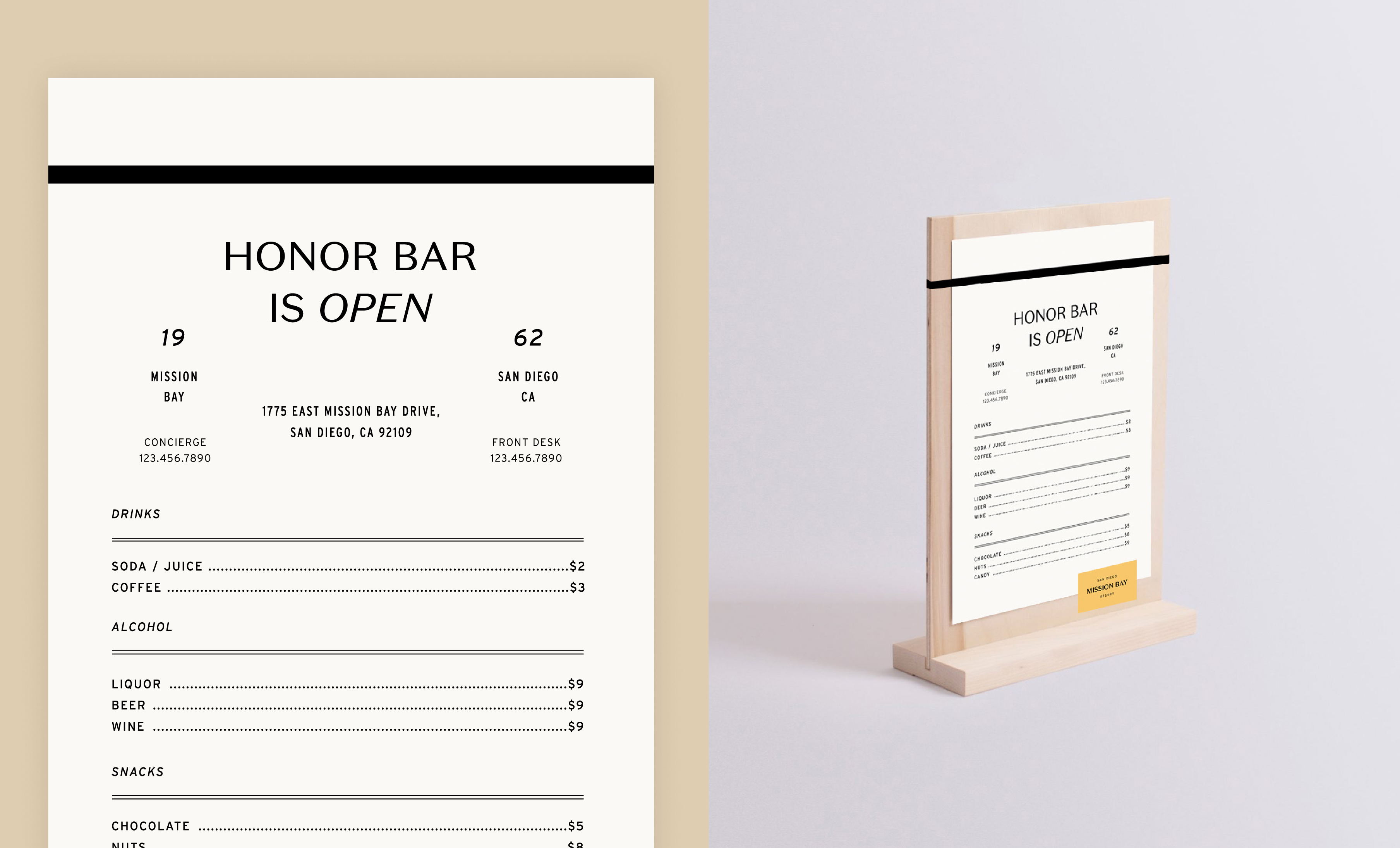
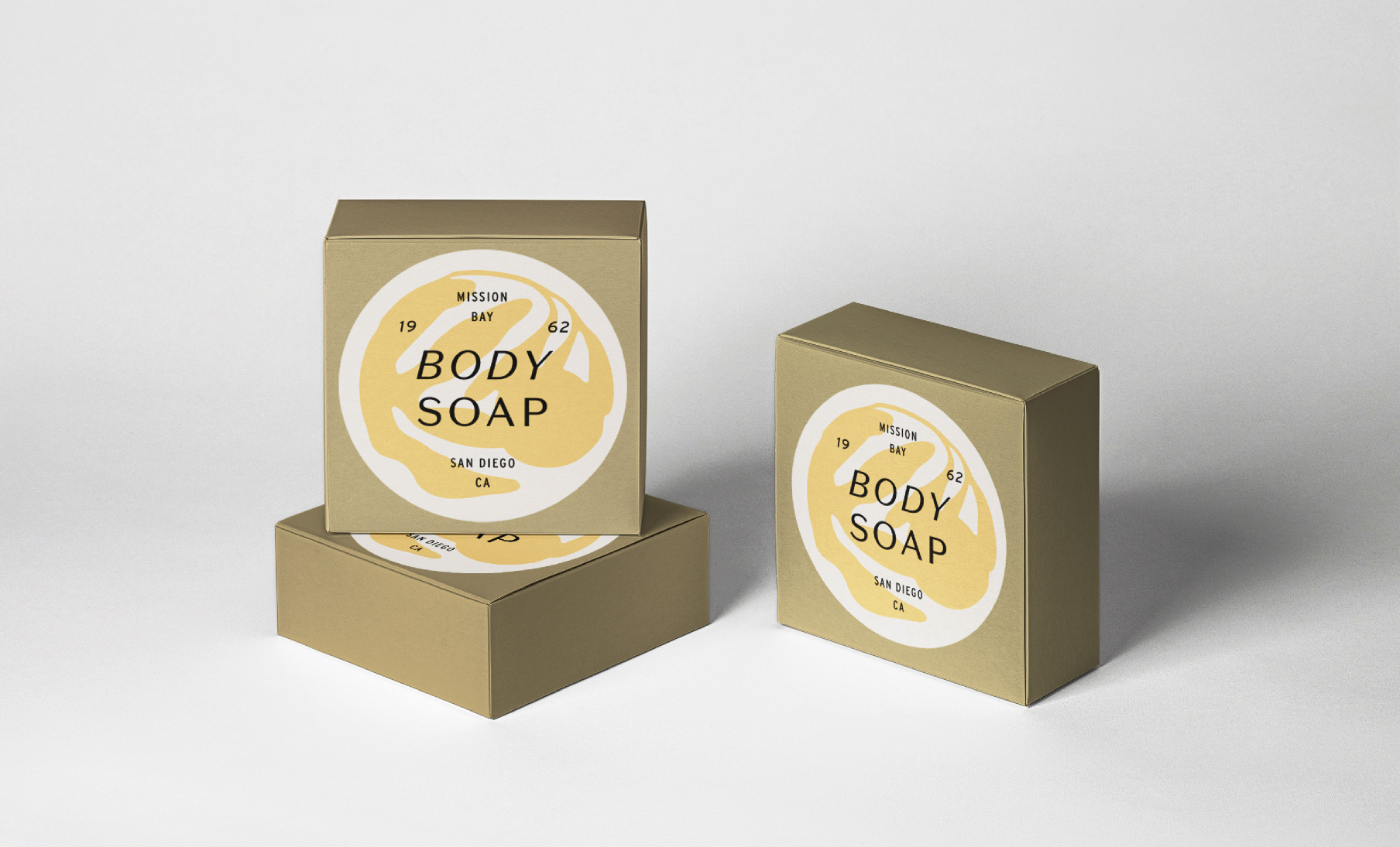
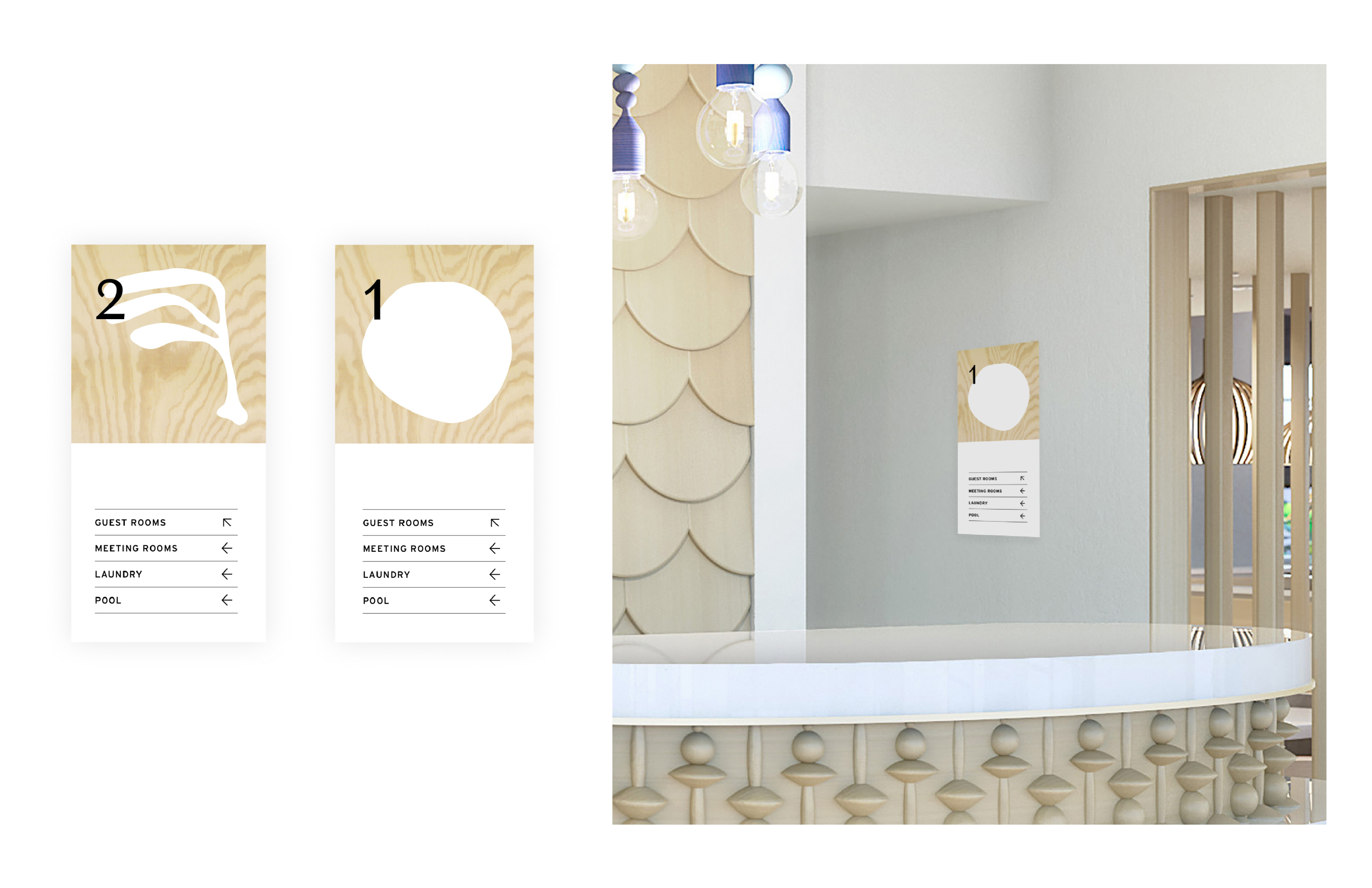
The system started with a logo built around restraint — a contained wordmark that works across every surface, from signage to a kayak paddle. From there, we developed a color palette rooted in the property itself: Sol Yellow, Bay Blue, Sunset Pink, and Sand. The type system pairs Domaine Sans Text with Interstate for a balance of unfussy luxury and confidence. Organic shapes inspired by the sun, sea, and resort spaces carry the identity into unexpected places — menus, water bottle tags, activity guides, and in-room collateral — creating a guest experience that feels cohesive from check-in to checkout.
For a closer look at any of the above, feel free to contact me at hello@mattnoe.com.